Tactical Arbitrage Web App Redesign
Improving online arbitrage tool to help find profitable products for reselling on Amazon

My Role
As a UX Designer, I did researched, drew wireframes, made prototypes, designed interfaces, and tested usability. I collaborate with product managers, developers, and other designers to translate business requirements into user-entered design solutions.
Company
threecolts
Duration
6 Month
Platform
Web
Team members
Hafiz Ibrahim
Ambroise
Deliverables
Research, Competitor analysis, Wireframe, Design System, High-fidelity Design, Interactive Design, and Usability testing
Project overview
Many Amazon sellers use Tactical Arbitrage for sourcing profitable products. However, new customers were leaving the dashboard home page early. Our analysis found that essential search options like Reverse Search, Wholesale Search, and Amazon Flips were overlooked, and missing search results confused users, hindering task completion.
Our goal is to boost new user engagement, decrease drop rates, and increase feature usage. To achieve this, we're introducing an enhanced design vision for the home page. This update aims to provide a comprehensive yet streamlined experience, allowing users to seamlessly track their sourcing efforts and access critical search functions effortlessly
Through close collaboration with stakeholders, we're focused on delivering a user-centric interface that simplifies complexity, ensuring users remain in control and fully utilize the platform's capabilities.

The Challenge
To start, I work as a product designer in a growth team focused on increasing the usage of Tactical Arbitrage and retaining new users on our platform. Our web app dashboard is the main hub for this. We've noticed that new users often struggle to understand the interface and become overwhelmed. They also tend to apply too many filters when searching, leading to poor search results.
How can we optimize our web sourcing analysis app to ensure customer ease of use while making the platform fast, user-friendly, and reducing the learning curve?
Some questions that will be addressed through the process:
What are the main goals when user finding profitable product?
Opportunity
How might we make Our Platform fast, useable, and reducing the learning curve

Tracking sessions data to understand user behaviours
After a deep dive into the watching sessions, we gained many insights about which pages users struggle with engagement, how long tasks take to complete, and the current design limitations that affect overall usability. We also identified accessibility issues and noted how difficult the steps are. If users face any technical issues, those were also pinpointed. Additionally, we checked the user retention rate
Understanding the business, interviewing stakeholders and analyzing initial metrics.
Through multiple meetings and the utilization of questionnaires, we were fortunate to gather valuable insights. Additionally, we were able to obtain quantitative data, which proved instrumental in initiating our research process.

Business goals
1
Improve use case adoption
User are drop out to understand how to work search and filter option
3
Improve the engagement
our new users due to their low task completion rate
4
Unify the flows
Unify and improve current experience, make it consistent and user friendly
Key Performance Indicators (KPIs)
1
Increase recurring revenue
2
Reduce cancellation rate
3
% of customers with other 3C subscriptions
User testing & research
We plan to have direct conversations with our users to understand their concerns and receive feedback. Through these conversations, our users have expressed that they tend to use too many filters when searching for products. Additionally, some users have voiced that the functionality and user interface of our platform can be confusing. We will also focus on addressing usability issues that have a significant impact on the user experience, in order to prioritize the most important issues.


Empathy Map
Through our research and contextual inquiries, we developed an empathy map to gain deeper insights into the problems and mindset of users. This visual tool enables us to understand user needs and motivations in a clear and concise manner. Understand and empathize with your users
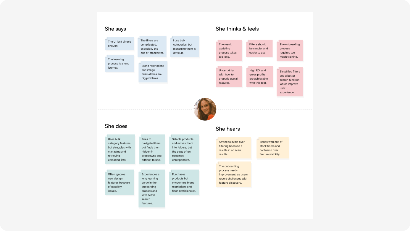
Pain Points
Learning Process:
It’s too long and complex, especially during onboarding.
Search and Filter Complexity:
Active search and filters (e.g., out-of-stock filter) are difficult to use, leading to user frustration.
Brand Restrictions and Image Mismatch:
These cause further complications, restricting what users can find or use.
Gains (Opportunities for Improvement)
Simplify UI and Filters:
Make the interface easier to navigate with clearer, simpler filters.
Accurate Search Results:
Ensure the filters return accurate, real-time results.
Enhanced Search Features:
Add features like price range filters and better visibility for searches.
Engagement Boosters:
Gamify the experience by introducing badges to motivate users to use the tool more actively.
Journey Map
Journey mapping helps us understand how users interact with a product or service. It identifies pain points, needs, and goals of users, enabling us to design effective solutions for their experience at each stage.

Summary of Journey Map
The user experiences a range of emotions and challenges as they navigate through the product search and filtering process. They start with high hopes of finding profitable products quickly but encounter issues with complicated filters, inaccurate data, and limited options for organizing their selections. Throughout the process, they engage with various interfaces to refine their search, cross-check products, and save their findings. However, frustrations arise when key features like filtering and product availability fall short of expectations.

Optimizing The Information architecture
Based on heatmap and video session results, we identified navigation challenges for some users. To address this, we conducted Treejack testing with familiar users, but most faced difficulties completing tasks. As a result, we are reevaluating and redesigning our navigation system to prioritize user-friendliness and accessibility.
Affinity Diagram Grouping/Themes
Affinity diagrams without doubt, these are the best tool for organizing the type of unstructured data

Summary of Finding
1. Filter Overuse:
Users often apply too many filters, which results in fewer search results and confusion. Simplifying the filter system or providing guidance on minimal filter use would enhance the user experience.
2. Feature Discoverability:
Many users are unaware of key platform features like Reverse Search or struggle to understand product data. Improving visibility and explaining features more clearly would help users take full advantage of the platform.
3. Training Resources:
Users feel overwhelmed by the amount of available training material. Simplifying training content and focusing on critical tutorials can reduce the learning curve and improve onboarding.
4. Product Matching and Data Quality:
Users need clearer indicators of match quality and ROI. By providing better guidance on these aspects, users can make more informed decisions.
5. Bulk Search Efficiency:
Users appreciate the bulk search function for its ability to compare products across platforms. Enhancing this feature and making ROI calculations clearer would help users maximize profitability.

Uncovering the Core Problem
Our team noticed that users were frequently requesting features that were already part of the product. Despite having created a detailed video explaining these features, users struggled to find or understand them. During user interviews, it became clear that no one was watching the lengthy video. To better understand the issue, we decided to investigate further. We conducted a survey and ran tree testing, which revealed that nearly 35% of users were unaware of the features altogether. This confirmed that our approach to presenting these features was not effective. As a result, we realized we needed to rethink how we introduce features, ensuring they are easier for users to discover and understand without relying on long-form content like videos.

First Attempts
Our initial hypothesis was that making the most important features visible on the dashboard would improve user engagement. We prioritized showing key metrics, such as the total number of products found over time, how many scans were active or completed, and notifying users when their scan limits were reached to encourage upgrades. So, we experimented with new UIs that highlighted these elements. However, to our surprise, it had the opposite effect. Users struggled to understand the total number of products found because some search options were hidden in a dropdown menu, making them difficult to locate. Additionally, users didn’t realize when their scan minutes had run out or how to update to a new plan. Many users simply ignored the new design and continued their tasks without interacting with the updated features.

Back to the Drawing Board
We recognized the need to focus on the users' needs and reassessed our approach to improve feature visibility. To do this, we prioritized clarity and consistency by making minimal changes to the existing UI that users were already comfortable with. We started by enhancing key metrics—such as the total number of products found and the number of active or completed scans—by placing them more prominently at the top with larger, more readable text, ensuring better hierarchy and navigation. Additionally, the search features were restructured, moving from a hidden dropdown to an unfolded card format, enhancing accessibility and clarity by making these options easier to discover. We also added a clearer call-to-action (CTA) for starting new scans, providing feedback to guide users through their actions effectively.To further reduce cognitive load and streamline processes, we improved the user experience with the plan manager by making the CTA buttons more noticeable and adding immediate alerts when users reached their scan limits. This allowed for easy recovery, ensuring users could purchase additional scan minutes without confusion, supporting error prevention and recovery.We introduced flexibility with new features like Guided Scan, Resources, and Scan Settings, offering multiple paths for users to achieve their goals. To boost emotional design and engagement, we also incorporated gamification elements like Earned Badges, motivating users to use the scanning tool more frequently.As a result of these changes, overall usage increased by 29%, demonstrating the impact of a more user-centered design. Some users even tweeted, thinking these were brand-new features, though they had been available for years, indicating the success of the redesigned user experience.

Built Design System from scratch
I spearheaded the design system by updating and maintaining components and patterns for customer-facing applications, ensuring consistency and efficiency across projects. In addition, I cultivated a culture of systems thinking across both design and development teams, promoting collaboration and alignment. Most notably, I successfully delivered a complete app redesign for customer applications within just 3 months, significantly accelerating the project timeline.

Results and Takeaways
Outcome
Increase in traffic and a low bounce rate 30%
Reducing user friction
Revamped the Web app's user interface, leading to a 30% increase in user retention over 6 months by enhancing navigational ease.
Reduced engineering costs 20% with build design system
Increase profitability by reducing support cost and improving efficiency
creating designs that are inclusive and accessible to all users
Key Learnings
Understand User Pain Points: Address confusing navigation to reduce bounce rates.
Iterative Design: Continuously improve the user experience through feedback.
Stakeholder Involvement: Involving clients in research streamlines decision-making.
Finding Opportunities Within Constraints: Viewing constraints from different perspectives helped us find new approaches to tackle challenges.
Leveraging Existing Resources: Utilizing Google's vast design resources saved immense time and overhead.
Early Cross-Functional Collaboration: Involving cross-functional partners from the start ensured holistic project progress, accounting for content strategy and technical feasibility.
Simplicity Over Complexity: Simplifying by reducing complexity, not quantity, led to a more intuitive and error-free experience, even if it meant adding an extra step.
Revamping Tactical Arbitrage’s UX transformed it into a more intuitive and engaging platform, significantly boosting user satisfaction and key business metrics.
What’s next?


Ink what you think?
Let’s talk about your project and how I can help you. We will respond within 2 hours
